USA Cycling is the national governing body for the sport of cycling in the United States. With a mission to develop the sport of cycling in the United States at all levels and to achieve sustained international racing success, USA Cycling supports cyclists from enthusiasts just beginning in the sport to seasoned professionals. They are best known for developing cyclists to represent the United States in international competition, but equally important is their support of amateur bike racing through grassroots development programs and promoting local organized racing.
The USA Cycling app is outdated and not user-friendly. Many racers rarely use it and non-racing cyclists have no reason to download it. It suffers from neglect, resulting in missing links, obsolete information, and a lack of compelling engagement.
The new and improved USA Cycling app will have a modern and bold aesthetic to represent the pride of American cycling. It will be advances enough to provide racers of all levels the necessary tools to be their very best, while the app will also be inclusive enough to welcome the new and inexperienced riders. The USA Cycling app will also integrate with the most popular cycling applications like Strava, Garmin Connect, and Map-My-Ride. We hope this app will be the gateway for riders and racers alike to embrace the health, camaraderie, and thrills that cycling provides.
This solution is based on four core tenets:
We outline the process of gathering user information and feedback and translating that data into the visual style and working function of the app.
This is a simple visual tool that captures knowledge about a user’s behaviors and attitudes.
This is our graphic organizer, helping us pre-visualize a user’s interaction with a task or action.
Illustrates the path a user may follow through our app to complete a task, such as making a purchase.
Utilizing interviews, user testing provides valuable feedback and insights into what users think and desire.
Visual comparisons between two design iterations, highlighting differences and improvements. (A & B)
Imagery, color, shapes, and typography enhances usability and improve the user experience.
A prototype is a working simulation of a functional product. It helps users understand a product.
Micro-interactions are small events that have a single purpose , often to improve usability or delight.
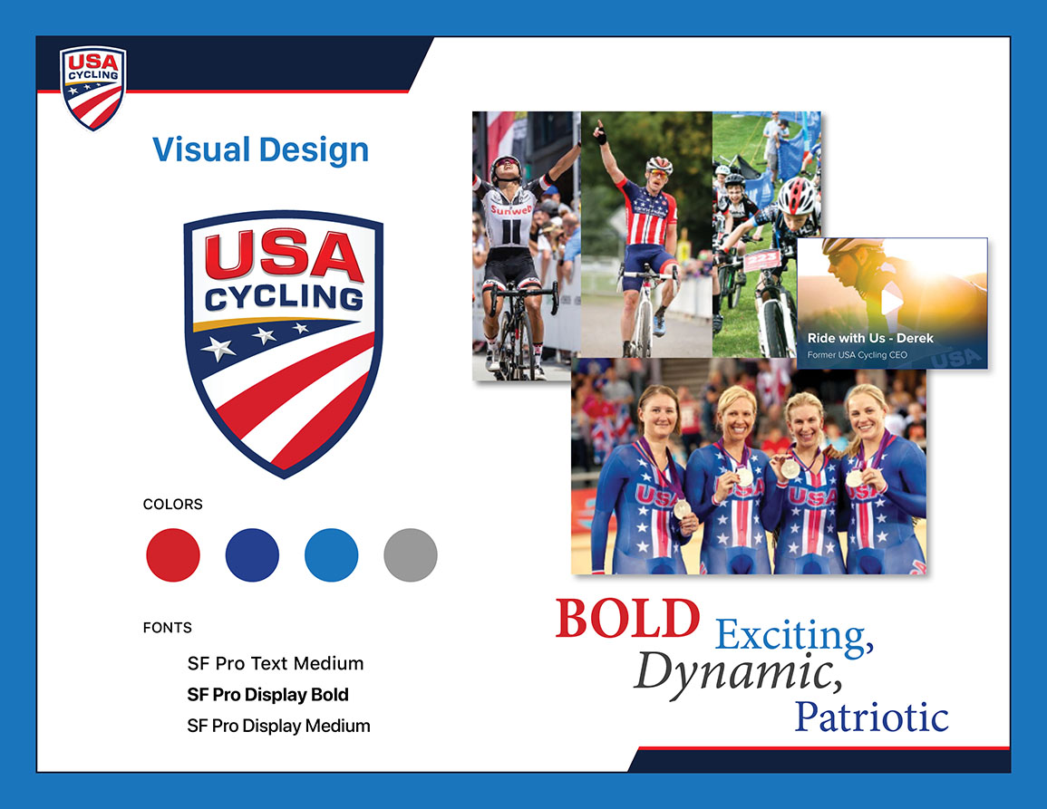
As the national governing body for the sport of cycling in the United States, I felt it was important to imbue the USA Cycling app with bold colors, symbolic of the United States and our national flag, but with a modern twist. Styles were kept simple and minimal. Vivid photography is used to instill vibrancy, interest, and dynamism.
