Bikely:
A UI/UX Case Study

Bikely is a local-search, travel, and social network app focusing on bicycles and cycling. It is a one-stop hub for all things cycling in a given city, things such as bike shops, repairs, rentals, traffic, bike routes, road conditions, weather, and bike-friendly places such as coffee shops, pubs, and lodging.
Bikely puts everything you may want to find, regarding cycling, at your fingertips. Whether you’re an experienced cyclist looking for a local group ride or a vacationing mother, looking for a safe, outdoor experience for the kids, Bikely can find what you need, when you need it…quickly and easily. Let’s Ride with Bikely!
This was a complete start-up mobile app spec project where I handled all design from ideation to completion. This includes User Research, Personas, Storyboards, Sketches, Style Guides, Wireframes, Mockups, and Prototypes.
The Challenge
Search engines are great for finding things but the Internet is a very big place. The problem we identified is that it’s often hard to find more localized information regarding a specific hobby, such as cycling:
“How do I find a local bike ride, shop, or group?”
The Task
Our first step in understanding the challenge was to identify our user. Our user would be anyone who is interested in two-wheel transport; the occasional or new cyclists, the avid rider, or just someone who needs to from A to B. Bikely will accomodate all of these users; Bikely will highlight experiences, community, and adventure. Such functions could include training how-tos, community forums and chats, and beginner tips.
The Solution
Bikely eliminates the need for endless searching of numerous sites. Bikely is a one-stop hub for all things cycling; things such as bike shops, repairs, rentals, traffic, bike routes, road conditions, weather, and bike-friendly places such as coffee shops, pubs, and lodging. It could integrate with urban bike-share programs and could even be extended to pedestrians-friendly businesses and routes. Bikely helps you enjoy the ride!
UX Design Process
We outline the process of gathering user information and feedback and translating that data into the visual style and working function of the app.
Personas
This is a simple visual tool that captures knowledge about a user’s behaviors and attitudes.
Storyboarding
This is our graphic organizer, helping us pre-visualize a user’s interaction with a task or action.
Visual User Flows
Illustrates the path a user may follow through our app to complete a task, such as making a purchase.
User Testing
Utilizing interviews, user testing provides valuable feedback and insights into what users think and desire.
Wireframing
Wireframing starts to formalize layout and hierarchy in a quick, effective lo-fidelity format.
Visual Design
Imagery, color, shapes, and typography enhances usability and improve the user experience.
Prototyping
A prototype is a working simulation of a functional product. It helps users understand a product.
Micro Interactions
Micro-interactions are small events that have a single purpose , often to improve usability or delight.
We designers are not the users!
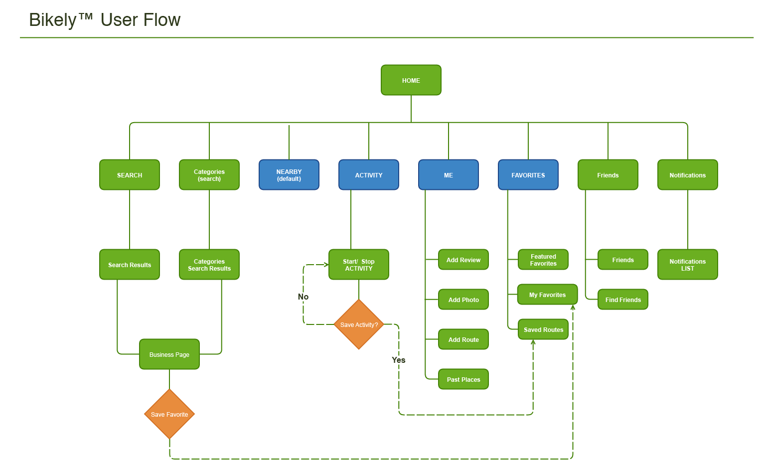
I developed a User Flow to empathize with our user’s journey through the app. This is an ongoing and iterative process as I continued to improve and refine the user experience.
Prelim Design / Wireframes
Sketches
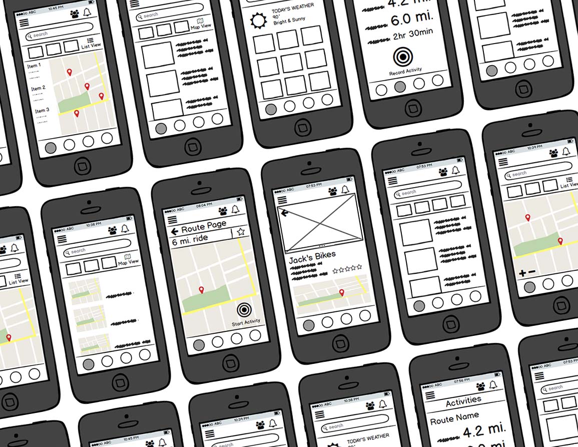
My first design phase is always with pencil and paper. I prefer using low-fidelity sketches for efficient, unconstrained brainstorming and collaboration. This way I don’t get bogged down in details so I am able to iterate quickly, keeping good ideas and discarding bad ones.
Wireframes
The next phase, wireframing, provided realistic design feedback, delivering insight into device and platform constraints. Keeping my wireframes low fidelity, provided quick iteration, yet offered users a familiar system for preliminary testing. I used a wireframing app but pencil and paper work just fine as well.
Visual Style Guide

App & Logo Design
Bikely is catchy, fun, and helpful. In turn, we developed a mascot to help us convey a delightful and personable user experience. The logo uses a rounded sans-serif typeface, giving it a professional yet casual presence.

Color Palette
Bikely is active and fun. For its color palette, we chose bright vivid hues that bring to mind the vibrant colors of spring in the outdoors; bright green and violet. We take your experience seriously, not ourselves.
Typography & Icons
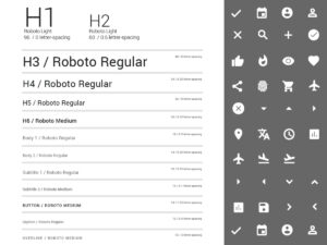
Bikely uses Android’s Material Design Guide for typography and system icons. Utilizing existing graphic conventions enhances user familiarity, improves accessibility, decreases development time, and lowers costs.


