International airports are huge. Typically, they are immense structures with loud, harried, and chaotic crowds. Personal service is spotty and directional signage can be indecipherable at worst and confusing at best. This can be a disconcerting and anxious experience for even the most seasoned traveler. And how do we know if our loved ones make it to flight safely? What if there was an antidote to this stressful airport experience?
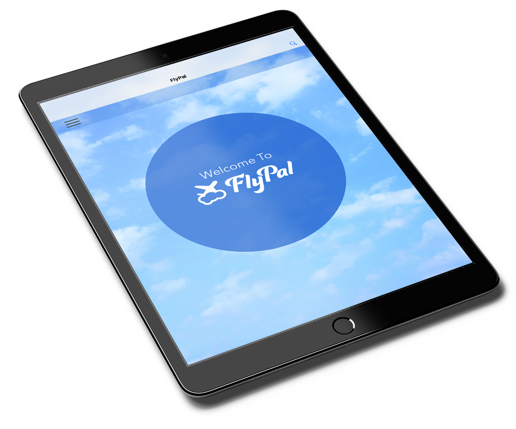
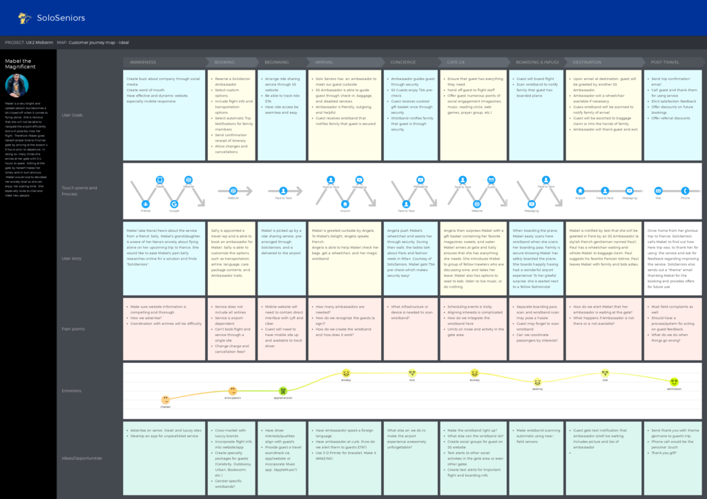
Introducing FlyPal: the airport concierge that takes the frustration out of airports. FlyPal provides your loved one their own personal Ambassador who will personally meet you curbside and escort them through the ticketing, security, and boarding process. FlyPal offers ADA-compliant services, language translation, and journey notifications so you know your loved one will board their flight safely and easily. With FlyPal, your airport assistant, they’ll never be alone.

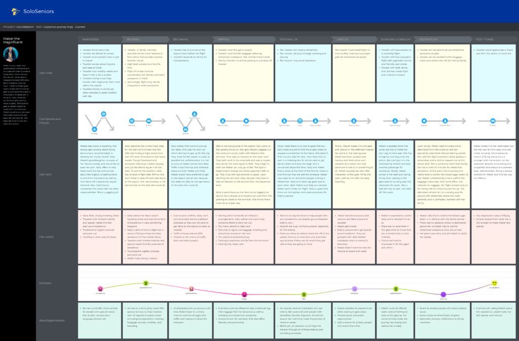
Our first step in understanding the challenge was to identify our user. Originally our user was an elderly person, your grandmother or “Nana”, who felt unsettled and unconfident. This person could use some help getting to their flights on time. However, upon further investigation, our team discovered that our true user was the loved one’s of the traveler. Our service would create peace of mind, joy, and aid the traveler’s family as much as the traveler herself.
FlyPal is more than an app and not just a website. It is a full-service concierge that provides companionship and stress-free airport experiences for people of all ages. Through an online interface, FlyPal pairs a traveler with a skilled and friendly Ambassador. The FlyPal Ambassador is the traveler’s personal aid in traversing the modern airport. Our ambassadors offer wheelchair access, language services, and will be with the traveler every step of the way–from curbside to plane.
Jaycee Cary • Sophia Huynh • Iris Wang • Mimi Balancia • Mariely Pozuelos
Interviews were crucial to our understanding of our user’s needs. We interviewed numerous people whom we thought could benefit our service. We spoke to elderly folks who need extra help, single fathers desiring a little peace of mind for their solo-flying teens, and travelers with disabilities. These interviews highlighted the wants and needs of our potential customers.


Interviews and user research often results in large quantities of data. This data is useful but is often lost on stakeholders. To make the data more relatable, we created a persona, an amalgamation of our data, that we felt encapsulated the qualities of our median user. This persona puts a name and face to our data, making it identifiable and empathetic to our stakeholders.


Our wireframes were both challenging and exciting. We chose to first sketch our wireframes on paper. This allowed for quick iterations and allowed us to painlessly discard designs that didn’t work. Once we had a basic layout, we progressed to wireframing software. This offered a robust symbol and graphics set and provided a firmer foundation for stakeholder buy-in. Wireframes were intentionally kept raw for increased flexibility in the development stage.
The next step is where the pages and screens start to blossom. We created moodboards to help define the feeling and mood. These helped us establish the visual language of the site. Would it be dark and mysterious or neon and futuristic? We ultimately decided on a medium-toned board which included vibrant imagery, smiling people, and the freedom of open sky.
Our Style Guide followed and cemented our visual form. SKY influenced our primary color of a medium blue with a secondary of light golden yellow, representing the sun over the horizon. Darker golden yellow and light gray rounded out our accent colors. For type, we chose Avenir Next, a sans serif font known for clean lines and great online legibility.